

What Can a Computer See?: Testing the Limits of Automated QA for Web Archives
This blog post was co-authored by Nicky Martin, a 2026 Junior Fellow, and his mentor, Tracee Haupt Fugate, a Digital Collections Specialist in the Web Archiving Section.
Preserving a website is complicated. Even a simple webpage can depend on dozens of images, videos, scripts, style sheets, and other resources scattered across the web. Some content appears only after someone interacts with the page, while JavaScript and other technologies can make parts of a site difficult for web crawlers to discover. If some of those pieces are missed, the archived version may look or behave differently than the original.
That is why quality assurance, or QA, is an important part of web archiving. QA is the process of assessing how well a website was preserved. Most of the websites we collect are archived weekly, monthly, or quarterly, producing a new “capture” or archived version, each time. This gives us opportunities to try different approaches if we weren’t successful the first time. Crawl reports provide clues about what was archived, but the best way to know if a website was properly preserved is to look at the archived site and compare it with the live version. Does it look right? Is everything there? Do the links work? Can you interact with all the features?
Can automation help with QA?
The challenge is the enormous scale of the Library’s web archives. We currently crawl more than 13,000 URLs, including websites that contain hundreds of pages. Those sites are also constantly being updated with new or changing content, making it even harder to keep up. Simply put, we can’t look at everything.
An article by Brenda Reyes Ayala, an Associate Professor at the University of Alberta, raised an intriguing possibility: what if a computer could do some of the looking for us? Reyes Ayala developed a suite of Python tools that automatically screenshot archived webpages and their counterparts on the live web, then use several algorithms to measure how visually similar the two are. She also made the code available on GitHub, so we could try it ourselves.
Nicky Martin, the Web Archiving Section’s 2026 Junior Fellow, adapted the scripts to work with the Library’s web archives.. Going into the project, we knew this type of automated QA would have limitations. A screenshot is a static image, so it cannot capture the full experience of interacting with a website. The scripts also compare only the homepage of each site, not every page within it. That meant the approach could only tell us whether an archived homepage looked like the version we intended to preserve—not whether the entire site was complete or its features worked as expected.
Visual similarity may be just one component of a well-archived site, but data from staff manually reviewing archived websites indicated a strong correlation between visual correspondence, completeness, and functionality. Captures that looked more like the live website also tended to preserve more of the site’s content and features, suggesting that visual similarity could provide a rough indication of overall capture quality.
With that in mind, we wanted to know what a computer would “see” when it “looked” at our web archive, and whether that information could help us be more strategic about how we review a large-scale web archive.
Taking the screenshots
The scripts take a list of URLs and open each one in a headless browser, a programmable web browser that runs without displaying a window on the screen. There were multiple configuration options, and for this project, we used Chromium with Selenium, which enabled us to automate basic actions a person might take while visiting a website.
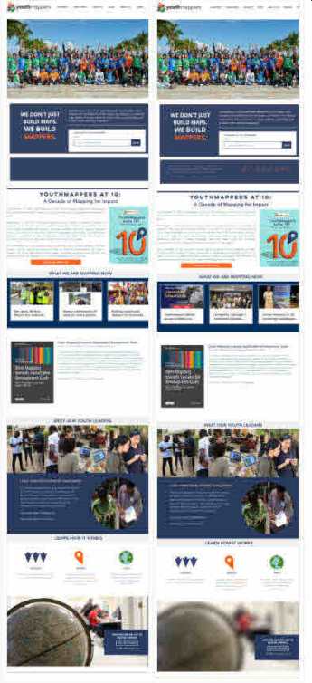
When the scripts run, the browser opens each website, closes (most) pop-ups, and scrolls to the bottom to trigger content that loads as you move down the page. It then returns to the top and takes a full-page screenshot, which may look unusually long and skinny because it extends beyond the dimensions of a computer screen.
The scripts screenshot the live webpages, then their archived counterparts. One of our additions to Reyes Ayala’s scripts was a way to use the Library’s CDX files—an index of archived websites—to obtain the archive URLs automatically. After everything is set up, the process can run across thousands of websites without someone manually opening each one.
How does a computer “see” difference?
After the screenshots have been created, the live and archived images are indexed by their filenames and passed to another script for comparison. This brings us back to the question in the title: what does a computer actually “see”?
Humans can glance at an archived website and notice that an image is missing, a heading has shifted, or an entire section looks different. A computer does not have eyes, so it has to “see” in a different way. Algorithms compare the pixels—their position, color, brightness, and intensity—to calculate how similar two images are.
There is no single mathematical definition of visual similarity, so we applied four methods:
- Percentage similarity compares the red, green, and blue values of corresponding pixels and summarizes the overall difference as a percentage.
- Structural similarity index measure, or SSIM, considers patterns of brightness, contrast, and structure within the images.
- Normalized root mean squared error, or NRMSE, measures differences between corresponding pixel values on a normalized scale.
- Perceptual hash, or pHash, reduces each image to a small grayscale representation and creates a 64-bit visual fingerprint. The two fingerprints are then compared based on how many bits differ. A pHash distance of 0 means the fingerprints are identical; as the distance increases toward 64, the images are increasingly different.
Putting it to the test
Nicky ran the scripts on over a thousand URLs, producing 954 successful pairs of screenshots. Comparisons were not possible when the browser failed to screenshot the page or, in a few cases, when the website was no longer available on the live web.
To make the results easier to evaluate, Nicky developed an HTML dashboard that displayed the screenshots side by side with visualizations of the similarity metrics. Juxtaposing the images and scores helped us better understand the strengths and limitations of the scripts.
One of the biggest complications was an expected one: websites change over time. If weeks or months passed between when a site was archived and when the live website was screenshot, ordinary updates could make the two versions look different even if the archived version accurately reflected the site at the time it was captured.
There were other problems, too. The live screenshots could contain errors of their own, so they did not always accurately represent the live website. Small issues, like a single missing element that shifted everything below it or a pop-up that did not close, could have a disproportionate impact on the scores. One of the most surprising findings was that mostly blank captures could sometimes score higher than expected. A human would see a mostly blank capture as having little to no similarity to the live site. But the computer saw a lot of white pixels, and if those pixels lined up with white space on the live site, they counted as similarity.
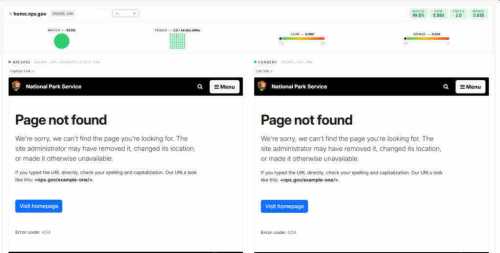
The computer identified visual differences, but it could not understand what caused them or judge whether they were important, and individual scores were sometimes misleading. But the tools did not have to be perfect to be useful. What we wanted to know next was whether those imperfect scores might still reveal patterns that could help guide our QA work.
For further analysis, we narrowed the 954 screenshot pairs to 236 that had been reviewed relatively recently by staff as part of our normal QA workflows. This allowed us to compare the automated metrics with human visual correspondence ratings ranging from 1 (unrecognizable) to 5 (appears perfect).
It was not a controlled experiment. The human ratings and automated comparisons were not necessarily based on the same version of the live website, and the staff assessments had been completed by different reviewers. Under more ideal circumstances, both assessments would take place as close to the end of the crawl as possible, with multiple people rating each capture so we could also measure how consistently reviewers agreed.
With that caveat, it was not surprising that the computer-generated metrics were only weakly correlated to the human ratings overall. The metrics were not very good at predicting the exact scores people had assigned, especially among captures rated 3, 4, or 5. But they were better at separating the captures reviewers considered least similar from those they considered most similar.
pHash showed the most promise at identifying substantial visual differences. Captures that human reviewers rated a 1 had a median pHash distance of 34, compared with 6 for captures rated a 5. To see how that might translate into a QA workflow, we tested what would happen if we prioritized captures with a pHash distance greater than 26 for review. That cutoff flagged 54 of the 236 captures, or about 23 percent, while including 9 of the 11 captures rated a 1 or 2. In other words, reviewing less than a quarter of the captures would have surfaced over 80 percent of the most severe issues.
The flagged group also included captures that reviewers rated higher, so a pHash distance above 26 was not proof that a website’s visual elements had been poorly preserved. However, when it is not possible to review every capture, prioritizing the ones most likely to have serious issues could be a way to maximize the benefit of human reviewers.

What next?
In the future, it would be interesting to repeat the experiment under more controlled conditions, which we believe would increase the correlation between human and computer-generated scores. There are also ways we could improve the tools themselves. We could update the scripts to use Playwright as the browser automation tool, for example, or add code that automatically flags mostly blank pages or pages that resemble known error messages. Nicky already added an option for labeling visual comparison problems in the dashboard, and with enough labeled examples, that data could eventually support experimenting with machine learning.
So to return to the question at the top of the blog post—what can a computer see? Quite a lot, but also not enough. The experiment demonstrated how much human judgment and context matter in QA. A person can recognize not only that two pages are different, but whether that difference matters and what might have caused it. But even with those limitations and an imperfect dataset, we still found patterns that could help us make more informed decisions about what to review and when. Automation cannot replace human judgment, but it can help us apply it more strategically to an archive of over ten thousand websites.
Seja o primeiro a comentar